This tutorial was written by Katherine Walden, Digital Liberal Arts Specialist at Grinnell College. The tutorial framework was created by Sarah Purcell (L.F. Professor of History, Grinnell College) Sophia Gates Stern, student mentor for this class.
This tutorial was reviewed by Gina Donovan (Instructional Technologist, Grinnell College) and Lauren Frankel and Martin Toney, student workers in Grinnell College’s Data Analysis and Social Inquiry Lab.
This tutorial uses data generated by Cameron Blevins and posted on his personal site.

Introduction to Mapping (Google MyMaps) is licensed under a Creative Commons Attribution-NonCommercial 4.0 International License.
Google launched Google My Maps in 2007 as part of the Google cloud services suite of programs. Through the My Map interface, users with a Google account can map points, lines, and shapes, with additional display customization options. My Maps allows users to generate maps from spreadsheets, work collaboratively on maps, and share interactive maps.
Historians have long used spatial analysis, but digital mapping tools have made it possible for historians to explore larger and more complex spatial data sets. Northeastern University historian Cameron Blevins does this in his research on the relationship between state formation, westward expansion, and the U.S. postal service. In this tutorial, we will be using some of the data sets from Blevins’s research to learn more about some of the digital spatial analysis and visualization tools used in historical research.
How Blevins describes his research (from his personal site):
My current project is a spatial history of two of the defining projects of the late nineteenth-century United States: state formation and western expansion. Between the 1860s and the 1890s, the western United States underwent one of the most dramatic reorganizations of people, land, capital, and resources in American history. How did this happen so quickly, and across such a large and inhospitable area? Why were so many people willing and able to move to such shockingly remote places? How did the American state consolidate its control over this vast territory? I argue that the sprawling infrastructure of the U.S. Post holds the key to understanding the speed and scale of western expansion. Gossamer Network uses a database of more than 100,000 post offices to map the spread of the postal network in the western United States. This presents one of the most comprehensive and detailed spatial renderings of the nineteenth-century state that has ever been assembled.
This analysis leads to a series of new interpretations about the American state and the West. The U.S. Post was the era’s most spatially expansive institution. No other network, public or private, connected so many different people in so many different places across such a large area. It did so by operating what I’ve termed a “gossamer network.” The U.S. Post expanded across space by grafting the public functions of mail service onto the existing operations of private businesses: contracting with a stagecoach company to transport bags of mail, or paying a local businessman to periodically distribute letters from his general store. This flexible, ethereal structure allowed the U.S. Post to expand and contract across remote areas with a stunning speed. Its ability to move in lockstep with Anglo-Americans had enormous consequences for the West, accelerating a pattern of imperial conquest and settler colonialism while serving as the underlying machinery of governance in the region. Gossamer Network sheds new light on the familiar subject of western expansion and forces us to reconsider the very nature of state power during this era.
Preliminary reflection questions:
- What are Blevins’s research questions?
- Why (and how) is spatial analysis important to addressing those questions?
- What types of data do you think Blevins might work with for this project?
- Do you see any potential challenges or limitations in using spatial data as the foundation for this project?
Data:
1-Navigate to https://sarahjpurcell.sites.grinnell.edu/digital_methods/files/1871_PostmasterSalary_Data.csv in a web browser and save the 1871_PostmasterSalary CSV file to your Desktop. Alternatively, you can go to the data page of Blevins’s personal site. Under the “Regional Data: Western Post Offices and Postmaster Salaries” heading, download the 1871_PostmasterSalaries CSV file.
2-Open the file in Microsoft Excel.
3-What fields are represented in the data? What questions do you have about the data?
4-Compare the original data source and what you see in the Excel table—what differences do you observe in how the data is represented? What types of questions do you think this data might be able to address? What gaps or absences do you notice in the data?
5-Save the file to your Desktop as a CSV. If Excel displays a warning message when you try to save as a CSV, click OK and continue.
A note on geocoding:
The process of adding spatial information to data or determining exact coordinates for locations is called geocoding. As you notice in Blevins’s data, the original data source does not include specific geocordinates for every post office location. Historically, gazetteer publications (essentially a phone book with locations and geocoordinates) were used to find place information for spatial data. Best practice for limited data sets is still to use a gazetteer to georeferenced spatial data, and the internet has increased the availability and searchability of gazetteers. However, manual geocoding is not feasible for many larger data sets. A variety of free and paid services offer automated geocoding.
The United States in 1871
One of the challenges in historical spatial analysis is maps, boundaries, and territories change over time. A map of the United States in 1800 looks very different than what we encounter in Google Maps or MapQuest. Explore a map of the U.S. that was drawn and published in 1871. Not all territories drawn on the map had been granted statehood in 1871. Consult a chronological list of U.S. states by date of admission to the Union to see what territories on the map would not have been recognized states in 1871.
Reflection questions:
- Why do you think it is important to understand the historical spatial context for Blevins’s data? What all do we know about context?
- How would something like knowing states’ dates of admission to the Union impact how we analyze spatial data?
- What features on the 1871 map stand out as significant?
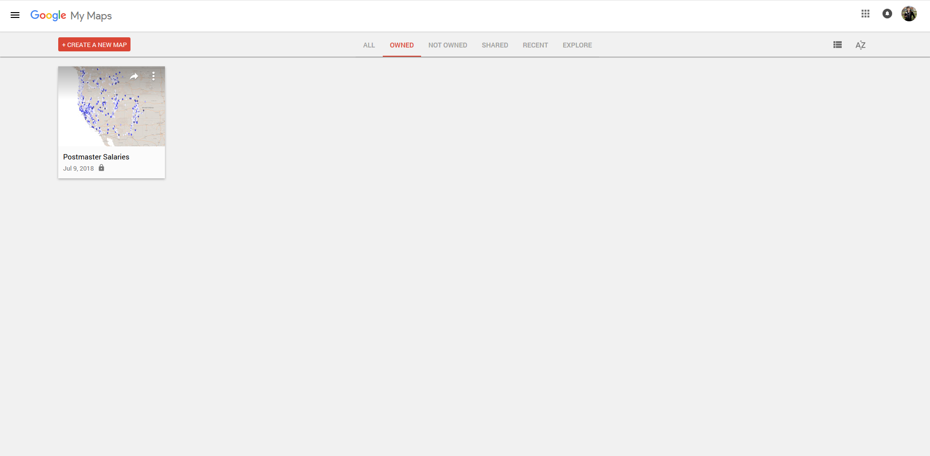
1-Sign up for a free Google Account, and use those credentials to log in to My Maps.

2-Click on the Create New Map icon in the top left-hand corner.
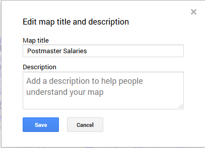
3-Name the map by clicking on Untitled map in the top left-hand corner. Use Postmaster Salaries or a similar descriptive name.
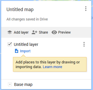
4-Click the blue Import icon to start the data import process. Select or drop the file marked: 1871_Postmaster_Salary CSV
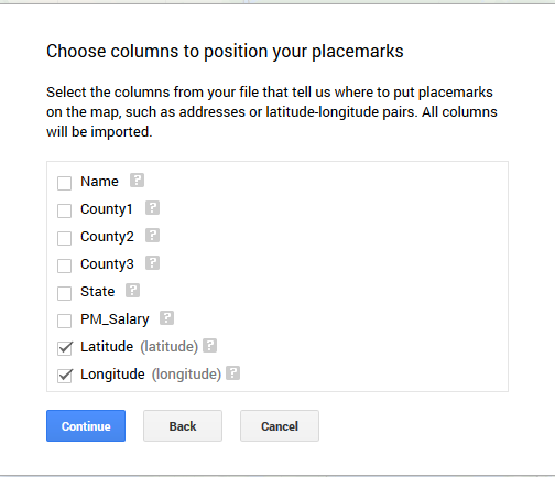
5-Check that only Latitude and Longitude are selected before clicking Continue. My Maps will keep all the original data records but needs to detect which fields contain spatial data.
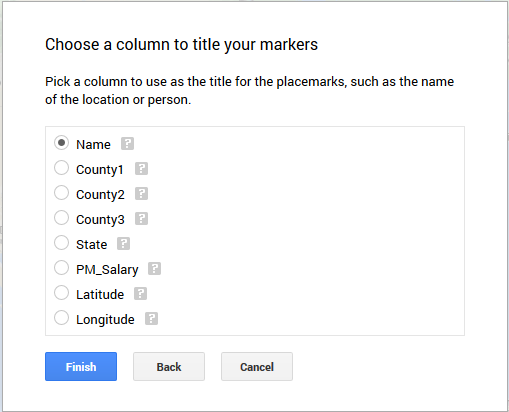
6-The next screen asks what field you want to use for the place marker titles. Select Name and click Finish.
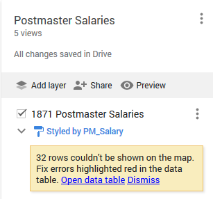
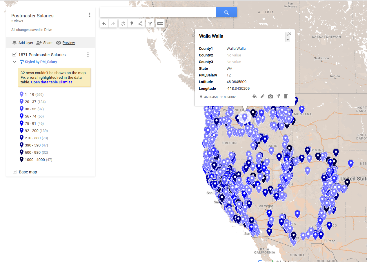
7-We can click on the three vertical dots next to the layer to rename the layer. Name the layer Postmaster Salaries or a similar descriptive title.
8-My Maps is showing a message that 32 rows in the data could not be drawn on the map. If you have additional time, you can come back and explore this error message. For now, click Dismiss.
![]()
9-At the bottom of the pop-up in the top left-hand corner is a Base map icon with a dropdown icon. You can explore different available base maps to see what works best with your data. For example, My Maps’s default base map includes topographical data. If that data is not essential for our analysis, a simpler base map (like Simple Atlas) can help users focus on the most important aspects of the spatial visualization.
10-Click on the blue paint roller icon to open a pop-up with style customization options.
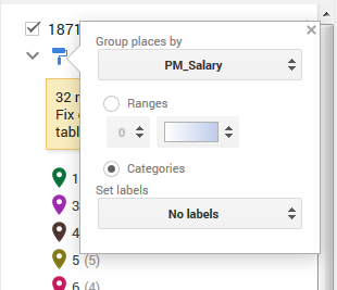
11-Click Uniform style and click Group places by, then select PM_Salary under Style by data column to color the data points based on salary categories.
12-Based on looking at the legend created in the last step, the number of Nulls and Others means the default options for this style don’t work effectively for our data.
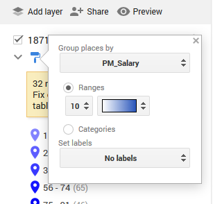
13-Click the blue paint roller icon again to reopen the customization pop-up. Change the selection from Categories to Ranges, and change the number from 4 to 10. My Maps’s default setting calculates categories for the data, but the range option lets us determine a specific number of range distributions. In this case, specifying 10 ranges effectively represents our data. You can click on the color dropdown to select a color gradient.
14-Is there anything the map doesn’t show that you wish were there?
Additional exploration:
- When we uploaded our data to My Maps, an error message said 32 rows could not be shown on the map. Open the data table and explore what patterns or discrepancies you can find for these rows. Why can’t the mapping program visualize this data? What would be involved in editing the data to make these rows display on the map?
- Continue exploring the display options in My Maps. What level of customization do you prefer?
Reflection questions:
- What types of projects or data could you see working best with a specific tool?
Introduction to Mapping wrap-up
Now that we’ve mapped Blevins’s data using Google, let’s explore how he maps this data in the larger project. As you explore the maps, keep in mind Blevins was focused on mapping post offices’ hours of service, rather than postmaster salaries which were the focus of our data.
Be sure to read the “About the Map,” “How to Use,” and “About the Data” sections on the interactive mapping site. Based on the choices you made about analyzing and visualizing your data in this tutorial, what thoughts or reflections do you have on how Blevins made similar choices, just on a much larger scale.
Read about how Blevins uses this data and spatial analysis to construct a historical argument about Postal Geography and the Golden West, as well as The County Problem in the West. How did Blevins connect the data used in spatial analysis to a larger historical argument? What role did the data and spatial analysis play in that larger argument?
Final reflection questions:
- What interested you in this data? Would you have been able to find this information and draw conclusions from it without using spatial analysis tools?
- What questions do you still have about this data? How could you answer them? How could you answer them digitally?
- Were there any issues we talked about in historical mapping (change over time, error, certainty, etc.) that you think of differently now that you have tried it?