Both physical and digital information needs to have some level of organization and description to make it accessible and usable. In this tutorial, we’ll use a historical data set to think about the types of datasets historians can use, as well as how we can describe and organize that data.
Ways We Organize Data
Most of the data you’ll use for tutorials in this class will be downloaded as a file of already-structured data. The work that goes into gathering, describing, and organizing this data happened before the course so you would be able to focus on analyzing and visualizing these datasets.
The Iowa Township data brings together federal, state, and local census records, as well as agricultural census records to collect demographic information and property ownership information for historic Iowa townships. In this tutorial, we’ll use an excerpt of the Township data related to censuses conducted in the 1870s.
As another example, historian Cameron Blevins uses spatial data to study the relationship between state formation, westward expansion, and the U.S. postal service. We’ll work with Blevins’s data in a future tutorial on spatial analysis, but compare the original data source and what you see in the table excerpted below.
| Name | County1 | County2 | County3 | State | PM_Salary | Latitude | Longitude |
| Arizona | Yuma | AZ | 360 | 32.72532 | -114.624 | ||
| Ehrenburg | La Paz | AZ | 140 | 33.60419 | -114.525 | ||
| Florence | Pinal | AZ | 12 | 33.03145 | -111.387 | ||
| Fort Bowie | Cochise | AZ | 12 | 32.1498 | -109.453 | ||
| Grant | Pinal | Pima | AZ | 12 | 31.40315 | -110.916 | |
| Hardyville | Mohave | AZ | 180 | 35.045 | -114.622 |
What steps were necessary to transform the data from the original source to the structured table format? How much time do you think it took for this data to be wrangled into the table structure?
A note on terminology
The process of getting data into a structured from is often called data wrangling, mashing, or transformation. Preparing data for analysis and visualization can often be one of the most labor-intensive and time-consuming parts of a digital project.
As another example, later in the semester we’ll be working with textual data from digitized S&B issues. Browse the digitized versions of the S&B publication, and compare that to the text file excerpted below.
The name of this association shall he the
SCARLET AND BLACK Assn iATioN in: Iowa
COLLEGE.

ART. II ’OBJICCT.

The object of this asSo-siation shall be to
publish a semi—weekly newspaper at (itin-
nell. Iowa, devoted to the interests of Iowa
College, its students. alumni and friends.

ART. lII.-—IVII£.\‘IBEI{SIIII’

Any one, by paying one dollar (fit) the'
subscription price of the paper. may he-
comea member of the Assot‘iATtoN for that
year. and shall be. entitled to a vote in the
meetings of the. Asst’i:iATio.\' if present
What steps were necessary to transform the data from the original source to the text file? How much time do you think it took for this data to be wrangled into a text file?
Ways We Get Data
Historical data for digital history projects can come from a wide range of sources. Social Studies and Data Services Librarian Julia Bauder has created a guide to data sources available through the Grinnell Library. The Sociology Department’s Research Tools webpage compiled by David Cook-Martin also lists a number of data sources. Most of these data sources have already been organized and structured as data tables.
However, sometimes you may want to collect data that is not already available. For example, social media data or website data is not always readily available in a structured data form. For example, literary scholar Melanie Walsh used a Twitter web API to search for social media content about James Baldwin and Black Lives Matter. HTML files from websites can be downloaded using the Wget command line program. Resources like Hathi Trust and the Project Gutenberg offer full-text downloads of a variety of historical and literary texts. The Library of Congress’s Chronicling America Historic Newspaper Project uses a web API to make data about its vast newspaper collection available to users.
What is an API?
An web application programming interface (API) allows a user to interact with another computer program, rather than access online content via the public, human-readable interface. Web APIs are useful for making large underlying datasets available for download.
Ways We Store Data
Most of the data we will be using for tutorials and projects in this course exists as single CSV files. A Comma-separated values (CSV) file is a text file that uses commas to delineate fields of text. CSV files can be opened in spreadsheet programs like Microsoft Excel and text editors like Notepad. A text (TXT) file stores plain text data without any additional formatting or markup added by a word processing program like Microsoft Word.
Organizations like the Library of Congress and National Archives and Records Administration produce documentation about best practices and preferred file types for long-term storage and preservation for digital materials. Libraries, archives, and museums most often use these guidelines to support long-term access to data and other types of digital materials.
However, even though data can be stored in a stable file format for long-term preservation, those file types may not be the best way to interact with the data for analysis and visualization. For example, storing a large complex data set in a single CSV sheet might not be the most efficient way to analyze or visualize particular aspects or features of our data.
Exploring the Iowa Township Data
Navigate to http://sarahjpurcell.sites.grinnell.edu/digital_methods/files/1870_Federal_Census_Grinnell_Township.xlsx in a web brower and open the 1870 Federal Census Grinnell Township file in Microsoft Excel.
In the same folder, open the 1870 Grinnell City Census file in Microsoft Excel.
- What fields are included in these two data sets? What types of data are recorded in the Excel files?
- What questions do you have about the data–how it was gathered, organized, or structured?
- What types of research questions could you explore or address using this data? What types of questions would not be a good fit for this data?
However, even though data can be stored in a stable file format for long-term preservation, those file types may not be the best way to interact with the data for analysis and visualization. For example, storing a large complex data set in a single CSV sheet might not be the most efficient way to analyze or visualize particular aspects or features of our data.
Another way we can think about the structure of data is organizing it as a series of entities, attributes, and relationships. Those three elements are the foundation of entity-relationship diagrams (ERD) and data schema that are used to design and build databases. Click here to learn more about entity-relationship models and database structures.
Analyzing and visualizing data that exists in multiple linked tables, or a database, can require greater computing resources and sometimes additional technical knowledge. But as we’ll see in the next part of the tutorial, common programs like Microsoft Excel can be powerful tools for analyzing and visualizing large, complex data sets.
Ways We Analyze Data
A useful way to think about data analysis is to differentiate or start to categorize the types of activities that can happen under the umbrella of data analysis. Measures can involve performing simple arithmetic functions like adding or counting. Calculations involve transforming the data through a more complex mathematical operation or formula. A measure might count the total number of records or values in a category, while a calculation might determine an average or median for a particular combination of data features.
Fields like “Number of….” in the 1870 Grinnell City Census file are an example of measures.
The data in “Age…” fields is determined via calculations, based on a person’s date of birth and the date the census information was recorded.
What are other useful measures you can imagine for the township data? What types of calculations might help you more fully understand the data?
We can also think about the different between quantitative and qualitative data analysis. Even quantitative measures and calculations still involve a series of choices about how you label, organize, and analyze data. All data, data analyses, and data visualizations reflect a series of choices and decisions about information.
Ways We Visualize Data
To start exploring different types of data visualization, we can also think about the purpose or goal for why we are visualizing the data. Historical scholars can use data analysis to explain or illustrate. As data literacy scholar Enrico Bertini points out in a Medium blog post, “Data journalism has provided over the years most of the best contributions to the art of explaining complex things through data.” These types of data visualizations are often supported by narrative text and other types of analysis, research, and argumentation. In this scenario, the data visualization supports arguments made in other forms or modes of communication. The data analysis and visualization is driven or shaped by conclusions or arguments the author already has.
In contrast, researchers are increasingly moving toward data visualization as a type of analysis. As Bertini puts it, “The main goal here is to extract information out of data with the purpose of answering questions and advancing understanding of some phenomenon of interest.” Maybe a researcher wants to analyze an unmanageably large body of materials, like entire newspaper runs from multiple publications. In another scenario, a researcher might want to bring together a range of data sets that require computation tools to connect, integrate, or synthesize disparate elements. For example, Cameron Blevins’s research on political structures of power in the western U.S. involved building a database with information on more than 100,000 post offices—a data set so large that reading or analyzing it manually would have been of little use for building a larger historical argument based on the data.
However, visualizations can just as easily confuse or misrepresent users in their attempt to use digital tools to analyze data and build historical arguments. An entire subfield of data science is devoted to promoting data reasoning and data literacy skills—learn more by exploring the Calling Bullshit curriculum developed by Carl Bergstrom and Jevin West at the University of Washington. The examples provided below are adapted from case studies in the Calling Bullshit curriculum.
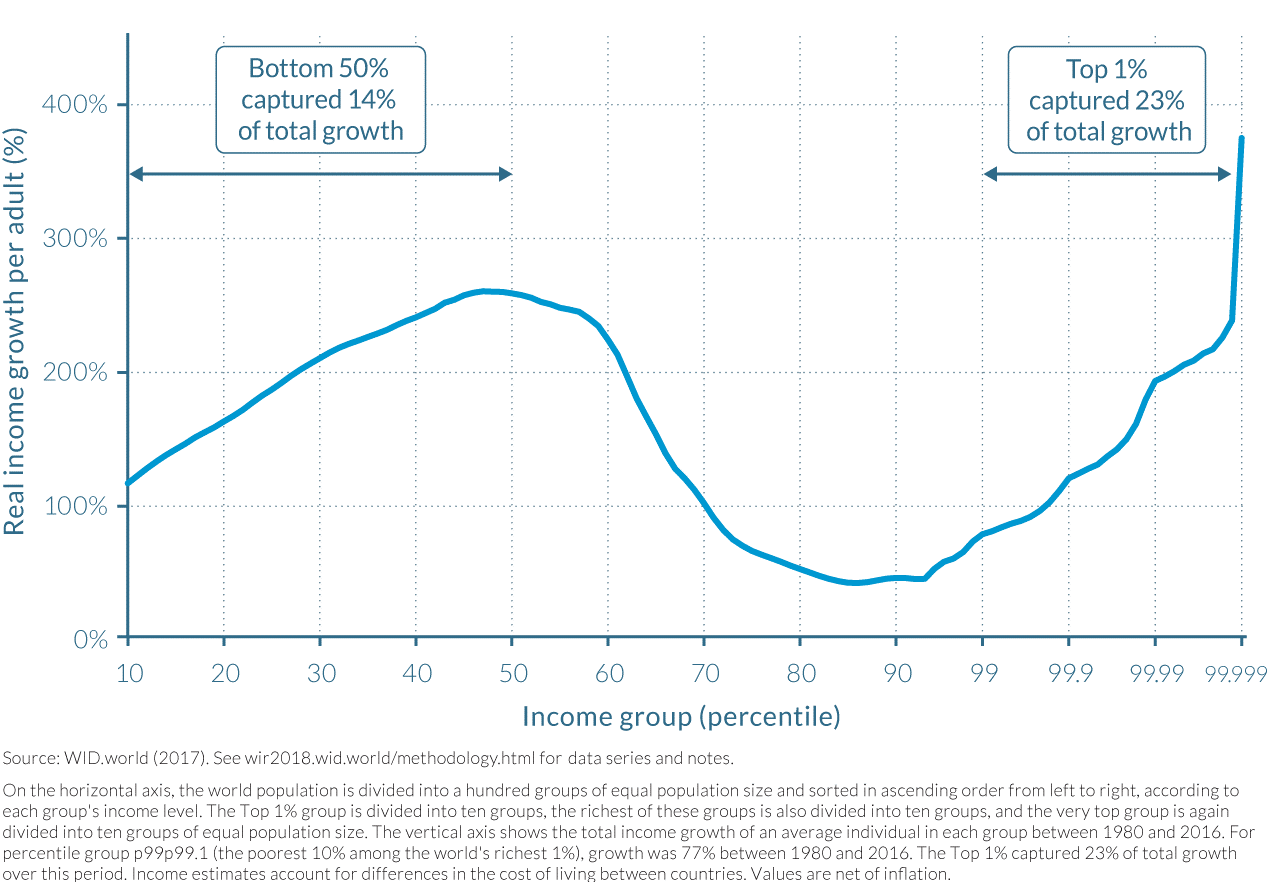
As an example, what data is being represented in this line graph? What are the calculations or measures represented in by the X and Y axes? What is your initial understanding of the data based on how it is represented in the graph? What concerns or questions do you have about the data and/or this visualization?
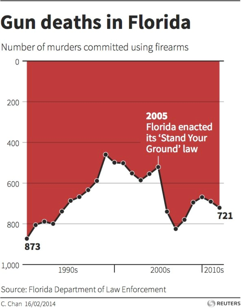
As another example, what data is being represented in this line graph? What are the calculations or measures represented in by the X and Y axes? What is your initial understanding of the data based on how it is represented in the graph? What concerns or questions do you have about the data and/or this visualization?
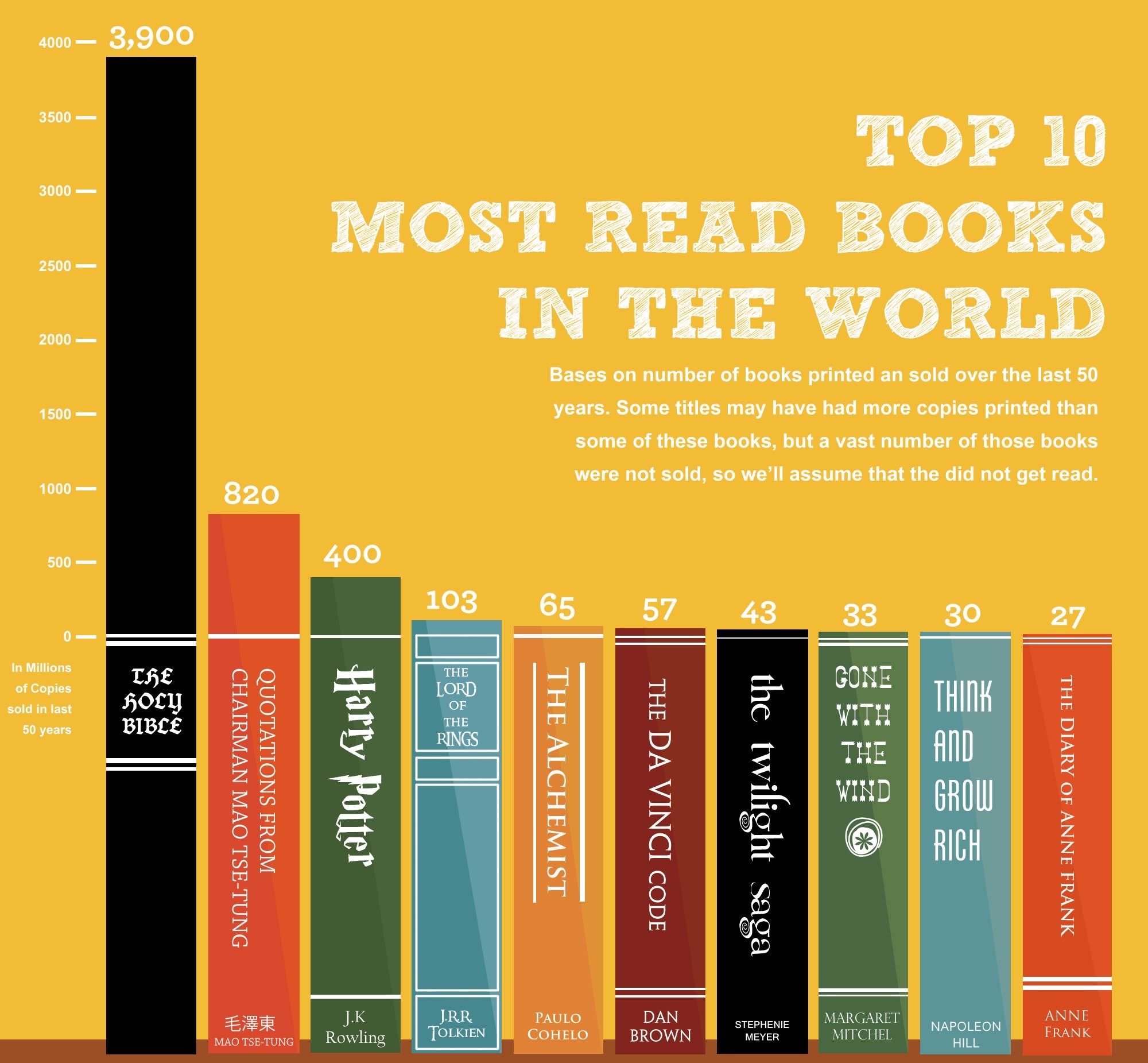
What data is being represented in this bar chart from Business Insider? What are the calculations or measures represented in by the X and Y axes? What is your initial understanding of the data based on how it is represented in the graph? What concerns or questions do you have about the data and/or this visualization?
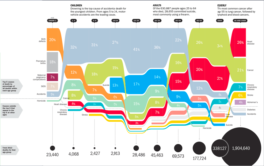
What data is being represented in this bar chart from Time magazine? What types of measures or calculations are represented in this visualization? What types of visualization or representation are happening in this image? What is your initial understanding of the data based on how it is represented in the visualization? What concerns or questions do you have about the data and/or this visualization?
The Calling Bullshit website also walks through the common pitfalls or considerations for different chart types by looking at issues with axes and proportional ink.